Treebū

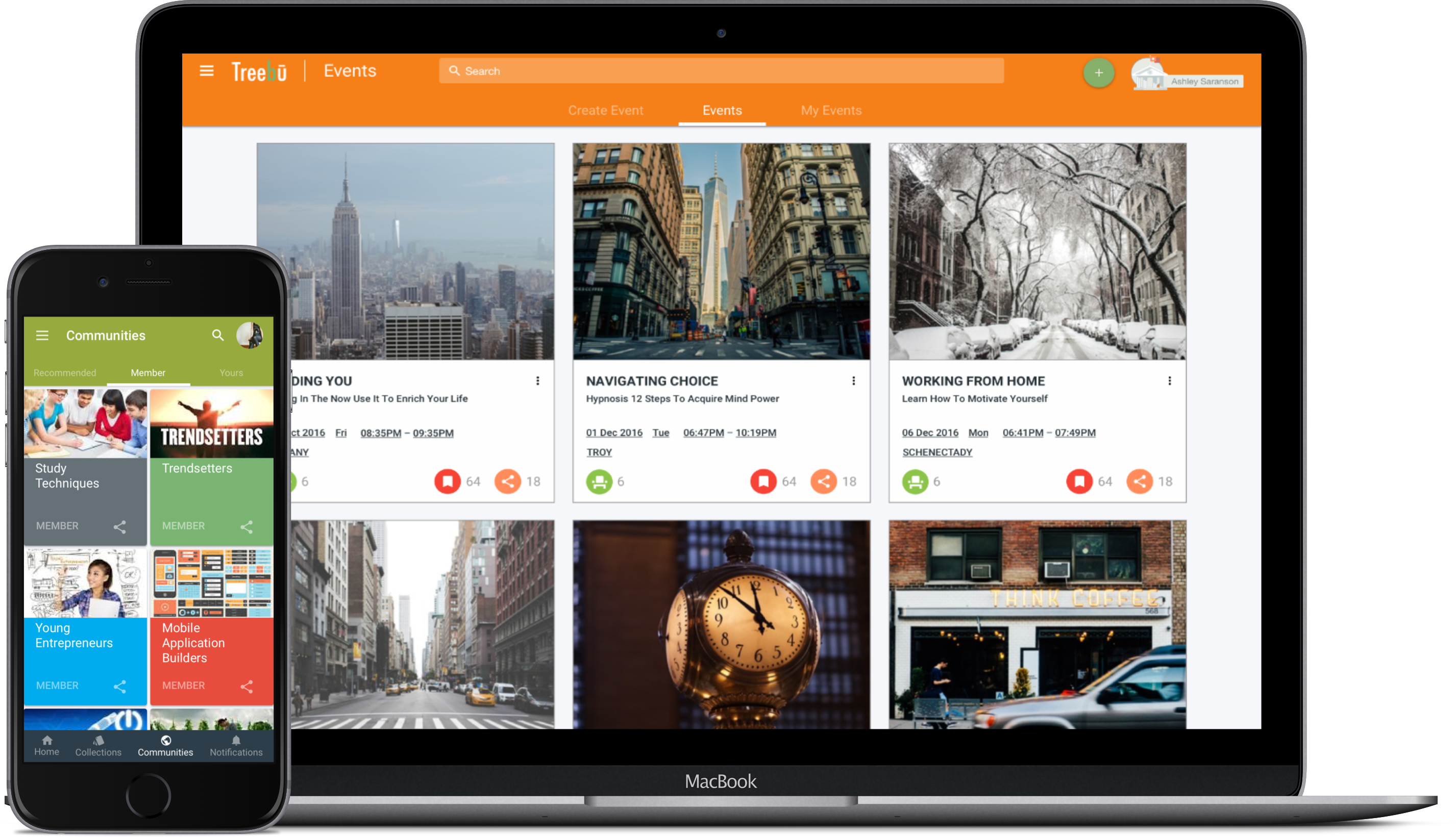
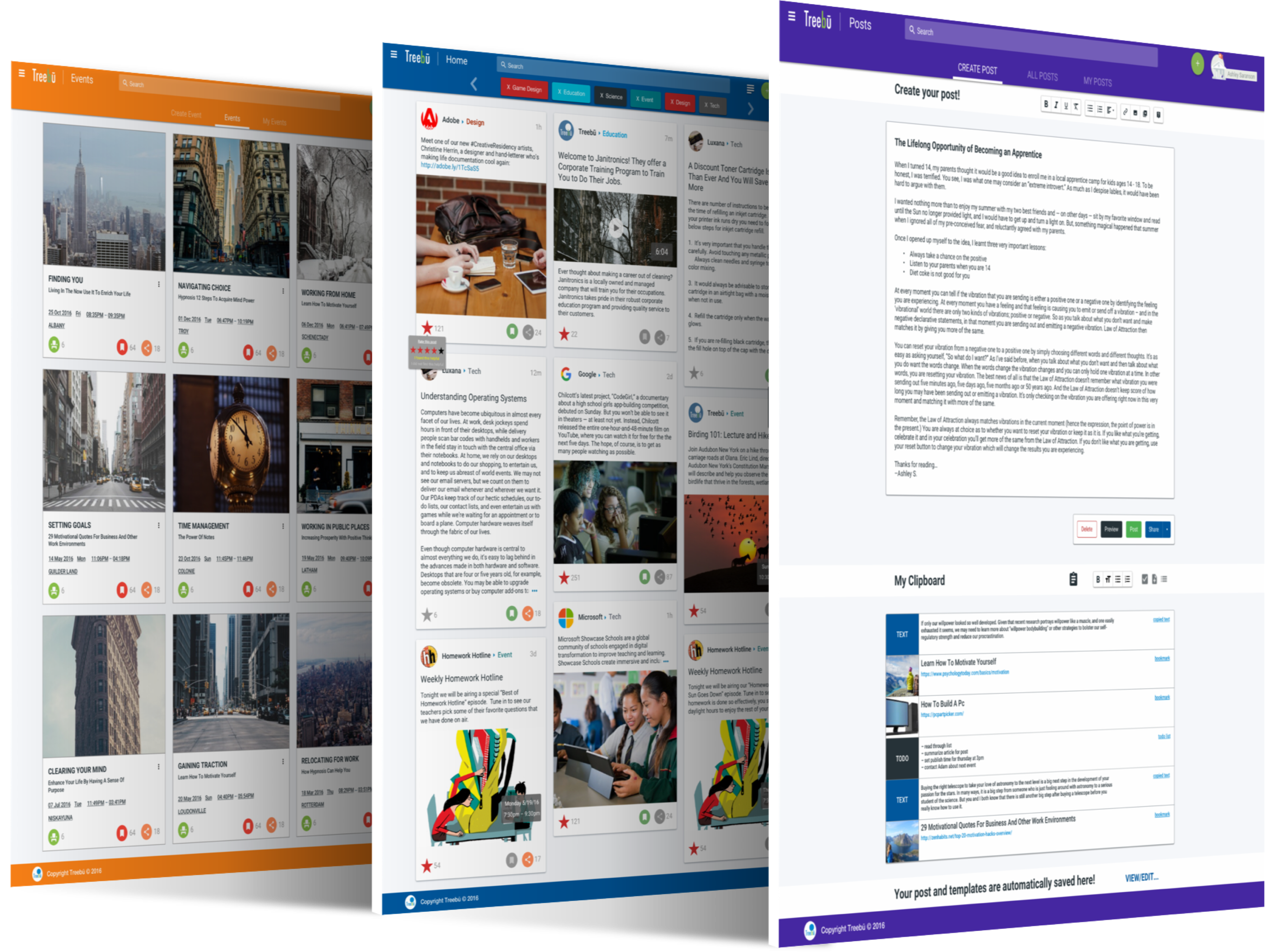
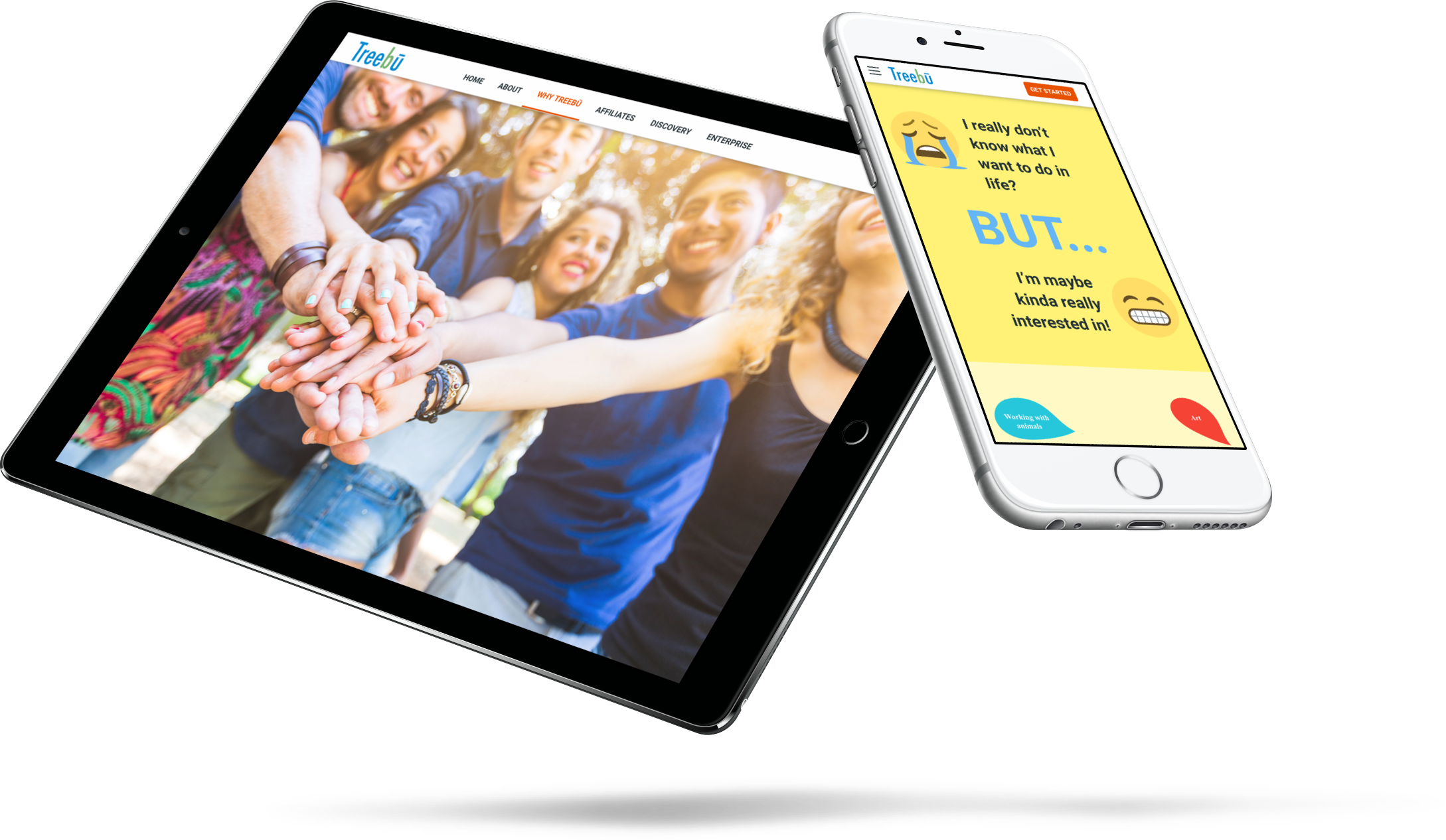
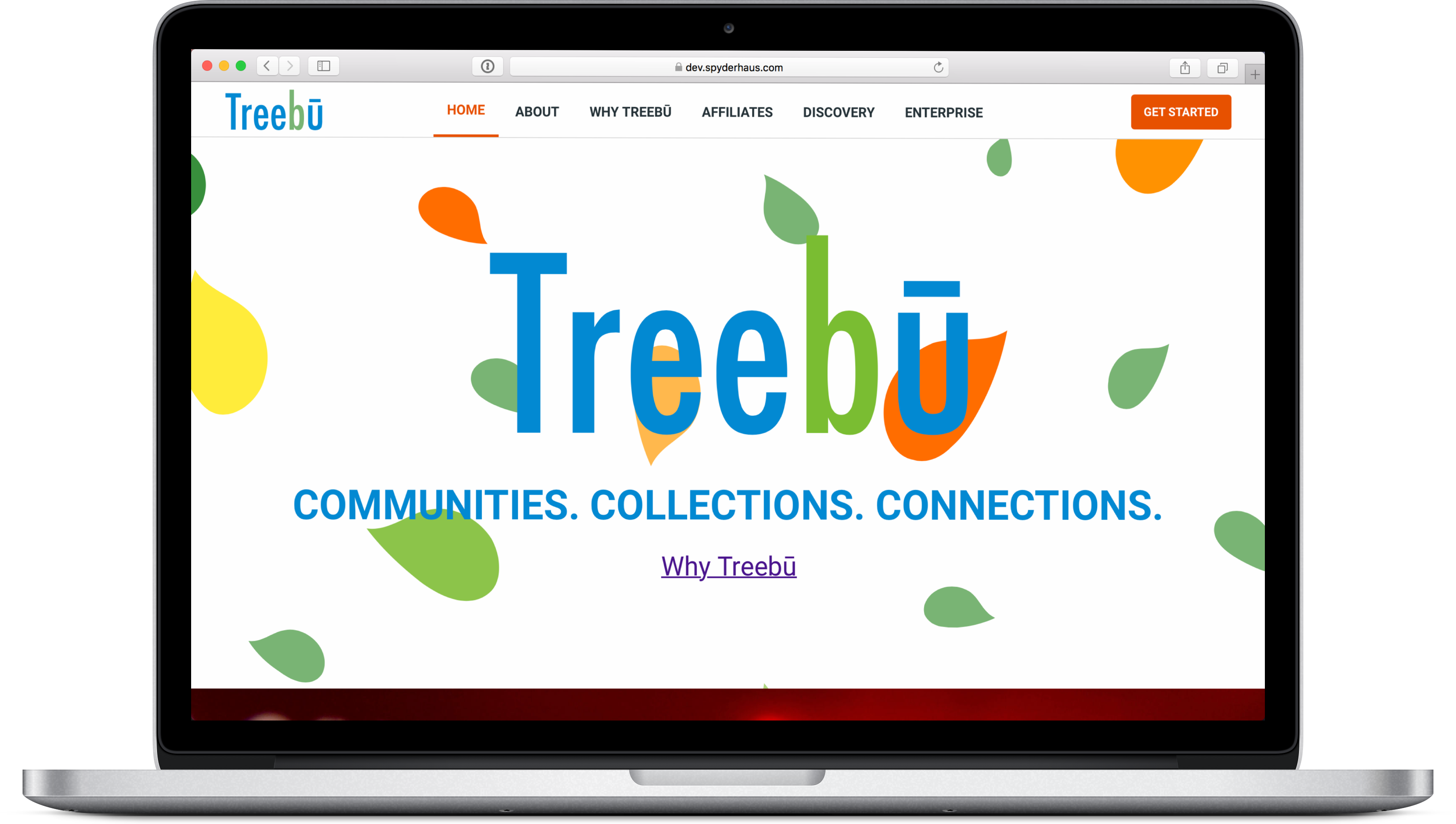
The Treebū web project started as a process in redesign for an established beta. The client wanted an inviting design which would be a pleasure to use for people of all ages. Once the platform UI/UX was statically redesigned and prototyped to test, I was asked to design and build a new functioning landing page. For this, I chose the same design language inspired by Google's Material Design that I used for the web app design.

view of event page desktop and community page in mobile

The Platform

The Challenge: Create a platform that users will choose to both create and consume content to share with colleagues and Explorers.

The Solution: Design a modular platform using Google's material design as inspiration.

Design the platform for a great user experience where the most necessary of tasks can be performed within the platform. Add excellent search functionality based on tags — with less clutter than other platforms — easing navigation for the user. Start with the most needed functionality and add features/benefits as user demand and/or desire increases.

mockup of Treebū platform featuring 3 screens angled for show

Post Create Extra Tools User Flow Example

breakdown of post create user flow study

The Landing Page

The Challenge: Convey what Treebū is without confusing buzzwords.

Initially, the client was having a difficult time putting together concise copy for a single landing page. The biggest challenge was getting first time visitors to understand what the Treebū platform could do without using typical buzzwords that generally confuse or alienate potential users.

The Solution: Add additional pages more detailed for copy and content.

I decided to remove the pressure from the client's copy team and create a visually inviting single landing page for a varied user base with a little amount of company text to try and explain Treebū. I then created secondary pages that a visitor could go through and learn more about the platform without having to officially sign up until ready.

landing page fun for younger audience using iPhone. Why Treebū page shown on iPad

One issue I find with many websites that ask a user to sign up: they don't offer a good enough glimpse into what the platform is, what it can offer the end-user, or who is involved in the platform.

The landing page will function to create curiosity about the platform and allow for beta tester and newsletter sign-ups. The following landing page steps will involve adding screenshots of what the actual platform will look like once a user signs up.

functioning responsive landing page in code

Additional Contributions

Copy:

Content creation supporting responsive web design including the crop, edit, compression, and export of images to CDN for multiple display/device sizes.

Presentation:

Static mock-ups transported from Sketch to Marvel for presentation. Screencasts featuring user flows with voice over, and Keynote with static prototype and brand style created for client presentations.

Development:

Github project setup, static landing page mocks transformed into identical functioning web pages, responsive page testing at all popular screen and device sizes, domain transfer tech support, Digital Ocean account setup, secure droplet creation and initialize incl. dev environments, installation of proper tools required for development, adding domain names to server, creating SSL Certificates, and server maintenance.